In a few weeks we will launch the first beta version of GLPI 10.
We are working on the last technical elements and preparing the release of compatible plugins on the Marketplace.
One of the biggest news of this version is a major overhaul of the interface and the user experience. The latest redesign since version 0.90 was done in October 2015.
Based on tabler, Bootstrap 5 and Twig, it brings many visual changes.
The integration of these standard libraries will make it easier to develop new interfaces and above all brings a “responsive” display mode that is easier to maintain.
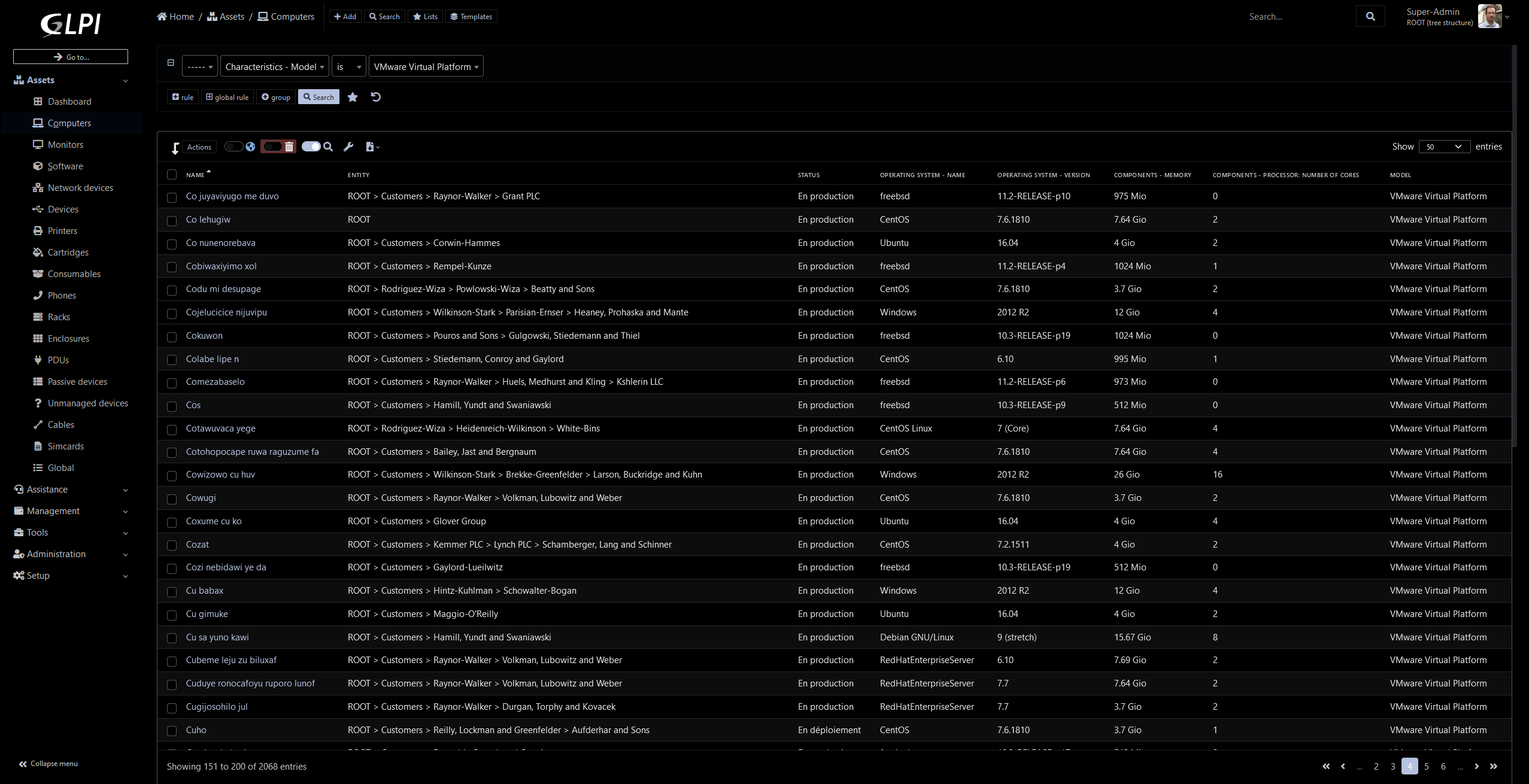
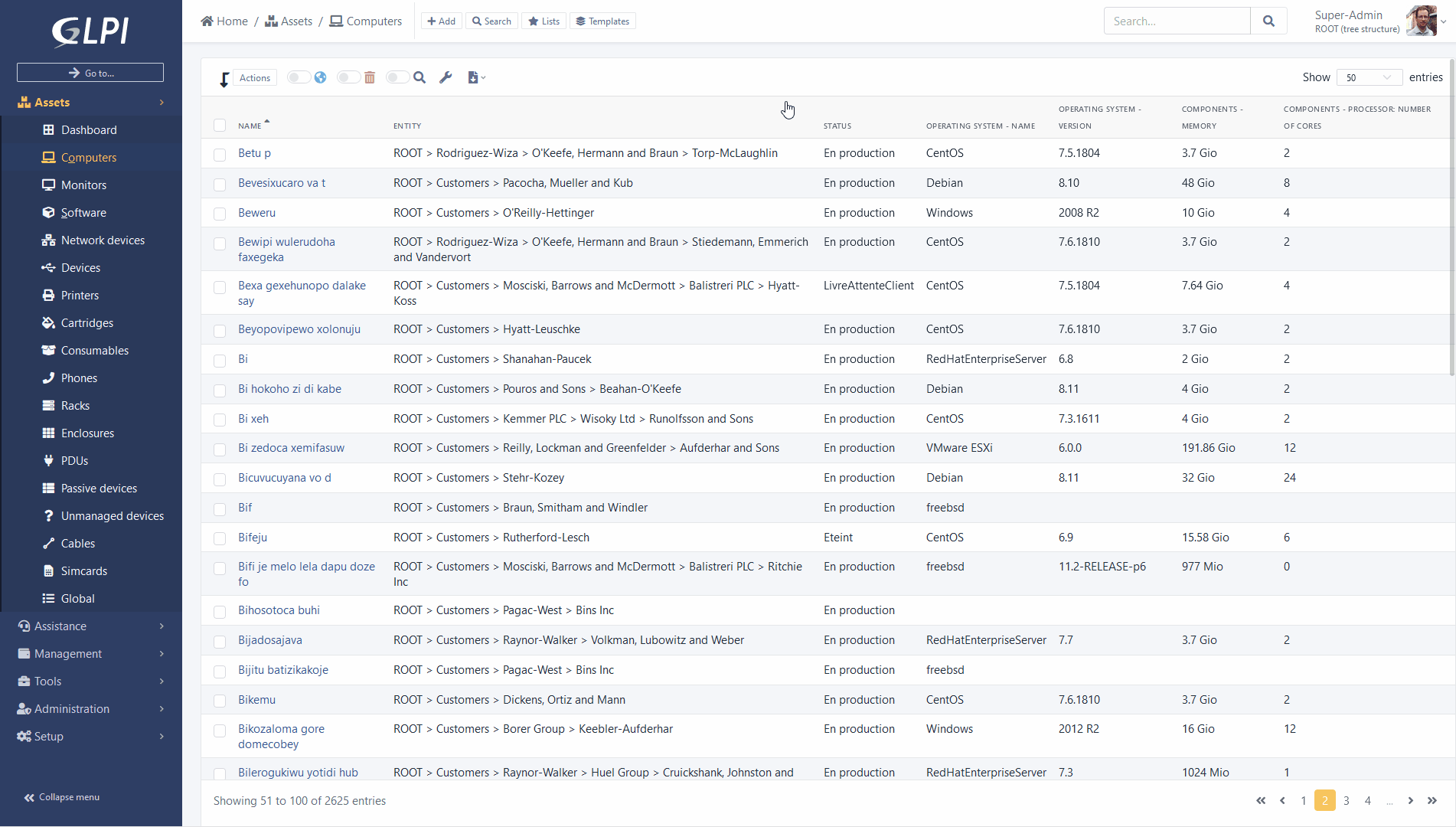
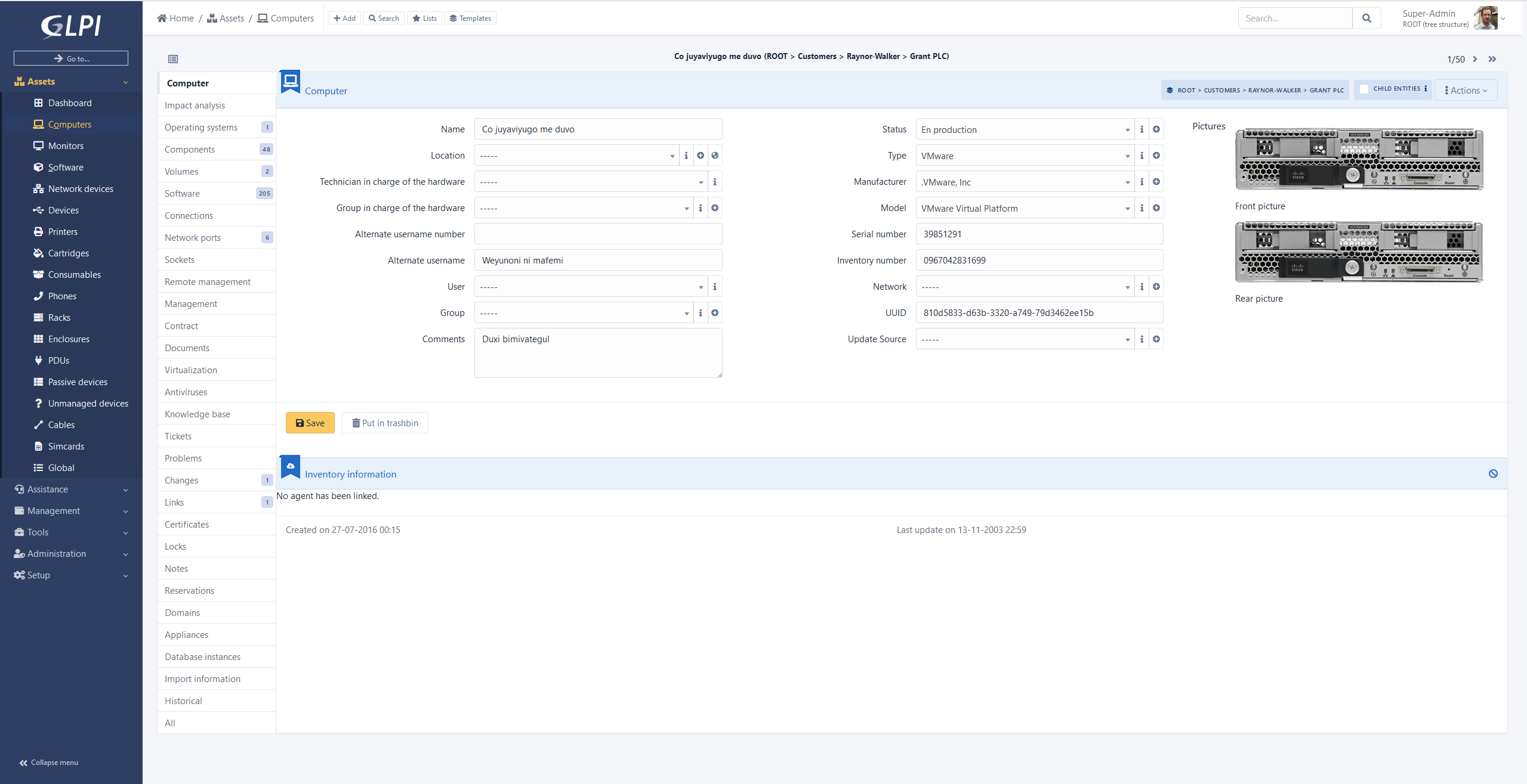
Here are some screenshots to give you an overview of the upcoming changes.
Beyond the change in design, we are making a number of user experience improvements, here is the list of key points:
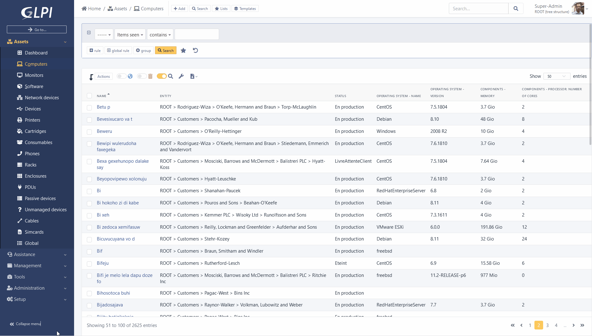
Vertical menu
As you have noticed on the previous screenshots, GLPI now offers by default a layout with a vertical menu. It is still possible to switch to a layout similar to previous versions (named Horizontal) in user settings.
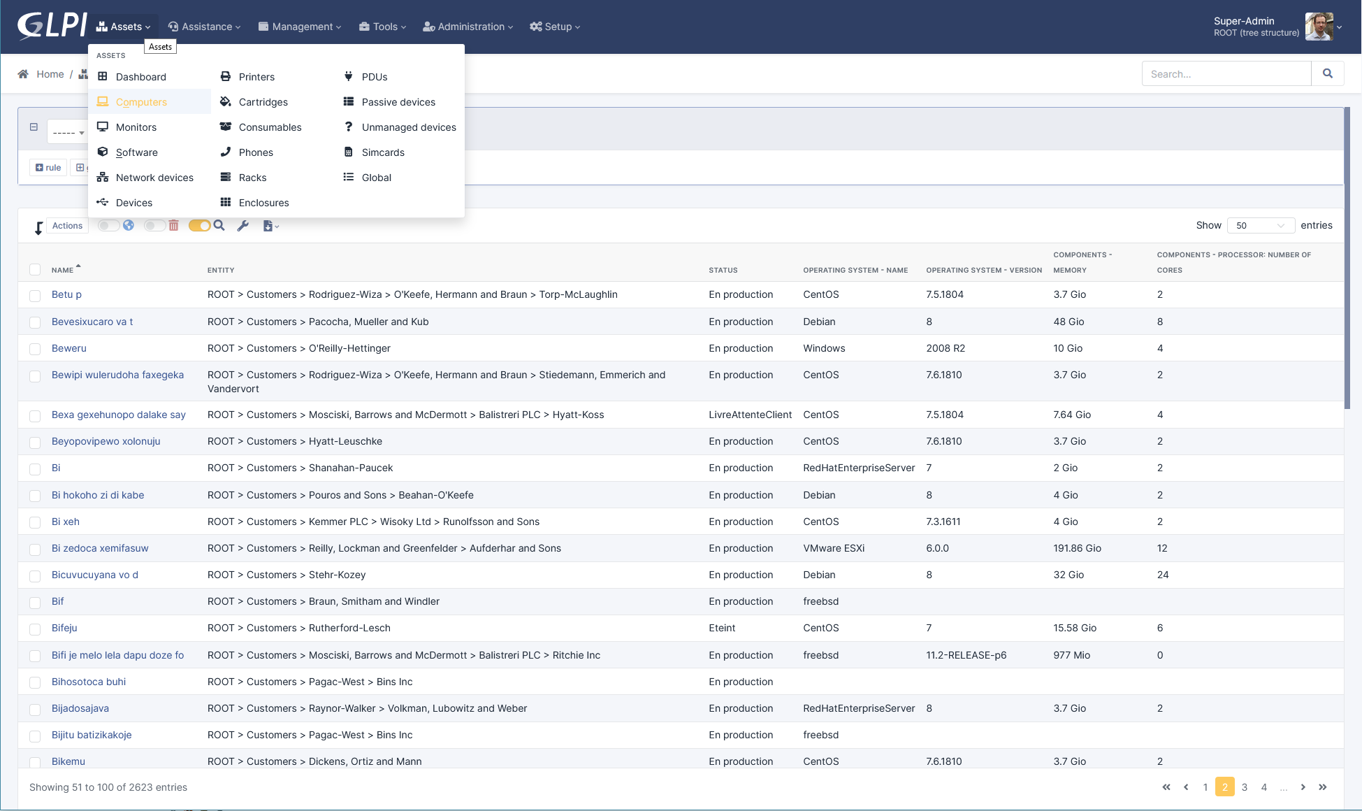
In the new layout it is possible to collapse the menu to have a compact display.
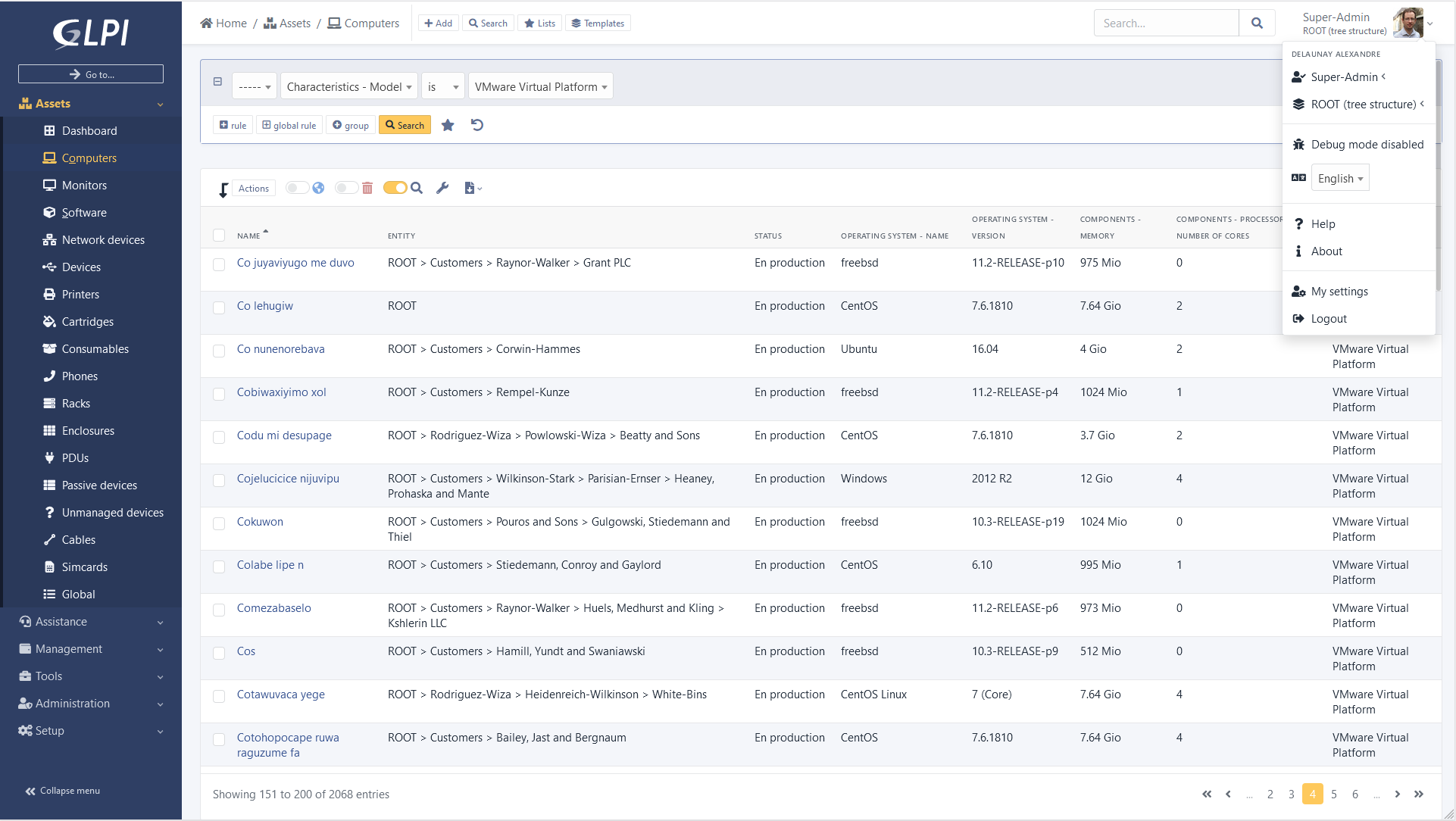
Button “Go to…”
Available since version 9.2 the “Go to” feature which allows a quick search of a menu is now highlighted and can be discovered on top of the menu.
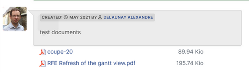
The park equipment now has a panel on their right side where you can click on the images attached.
“Saved search” panel
The “saved search” panel now integrated into GLPI design.
You can set it floating, or pinned to pages (to be kept permanently (even after browsing)).
Pinning is done page by page, e.g. a panel pinned to “tickets” will not be pinned to computers.
Note that now you can find it in the first tab, the saved searches corresponding to the type of object: list of tickets will be displayed according to priority of saved searches.
Second tab lists all other searches concerning other types of objects.
As the panel is now contextual to the type of object presented, you can access it via an icon named “Lists” placed next to the breadcrumb trail.
Invisible search engine
It is now possible to deactivate the display of the search engine.
You can navigate in GLPI only using saved searches!
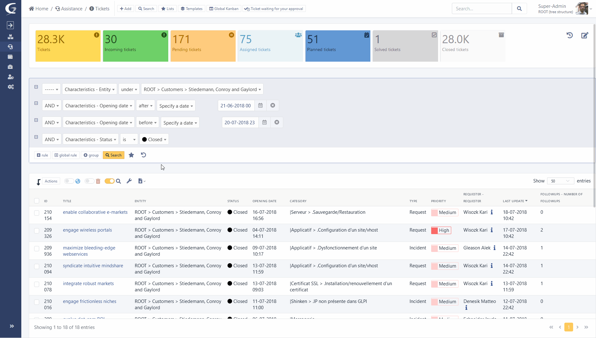
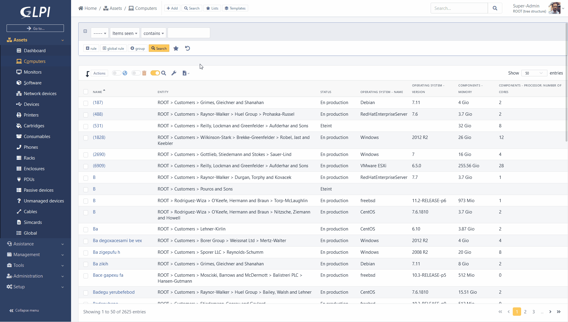
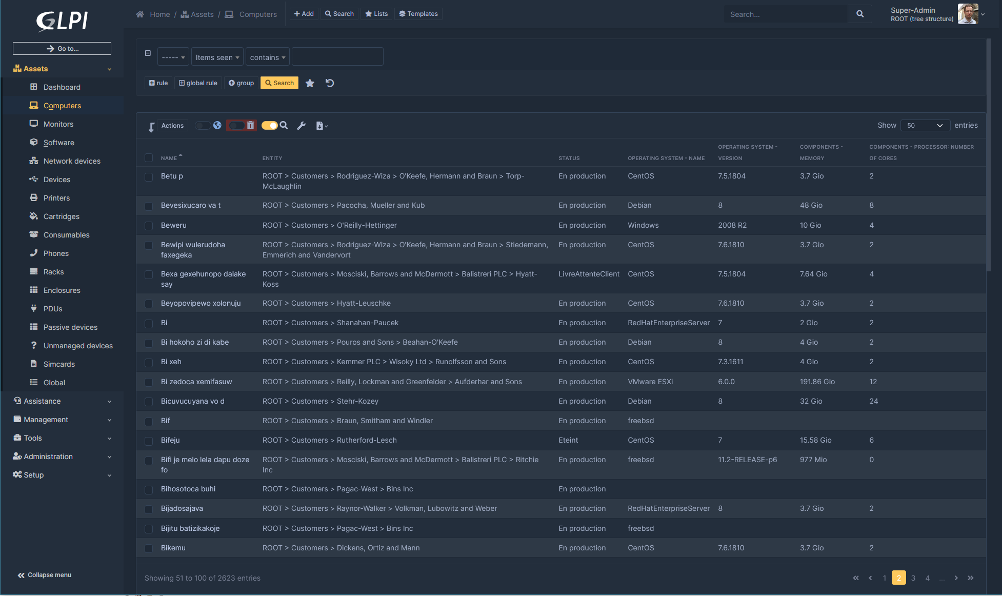
Dynamic loading of search results
The search engine display is now launched in “AJAX” mode. A loading icon is displayed when a search is launched, page changes or sorting is in process. Once new results are available, only the content is replaced and not the entire page.
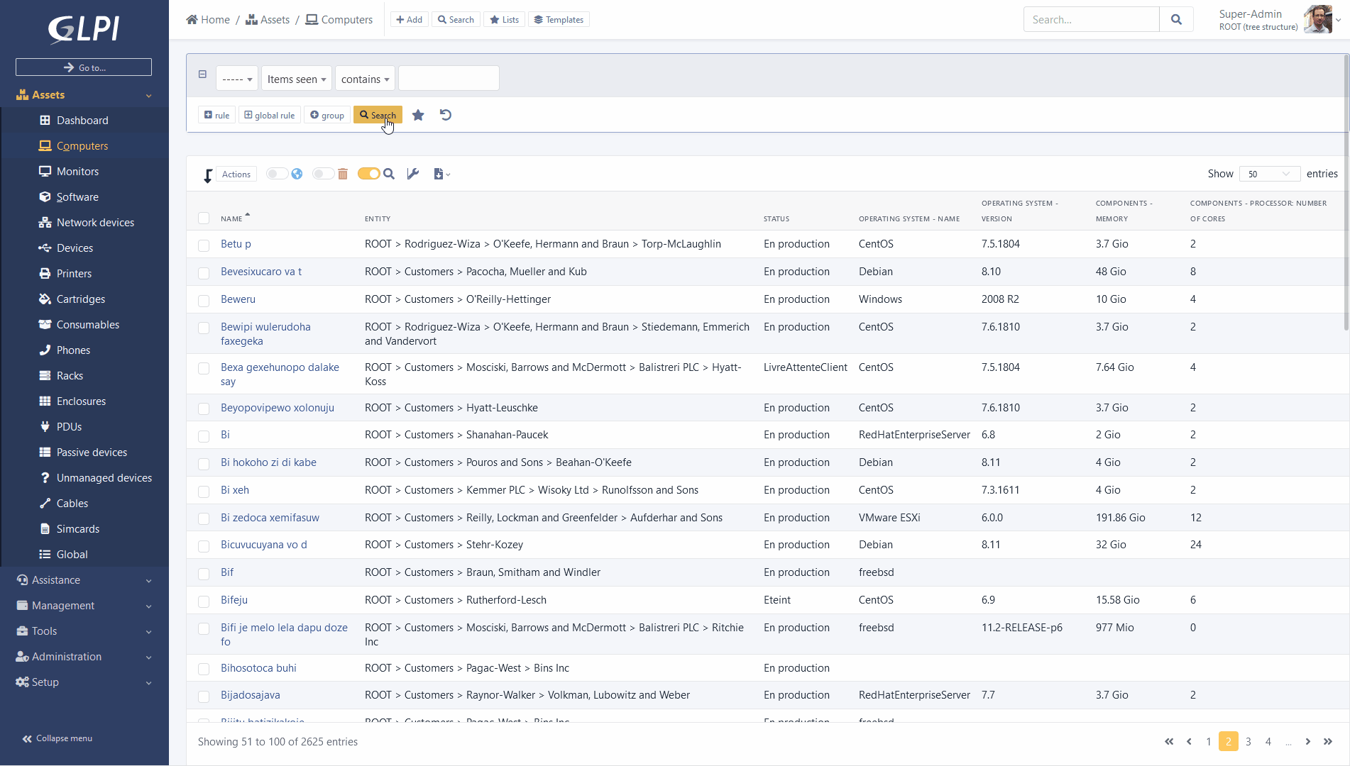
Multi-sorting of results
With a “ctrl” you can add several sorting modes to the columns of your search results.
Example: sort by “Name” and by “Modification date”.
Page of park elements.
The main element form now displays a panel on the right displaying the images associated with the corresponding model.
These images could be previously accessed only in the display part of data center racks, now they are available everywhere.
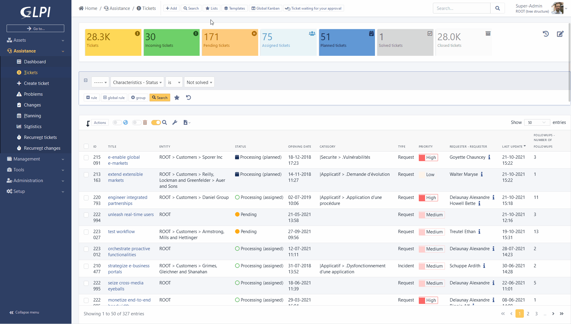
Redesign of ITIL objects
Display and use of ITIL objects (Tickets, Problems and Changes) are thoroughly reviewed.
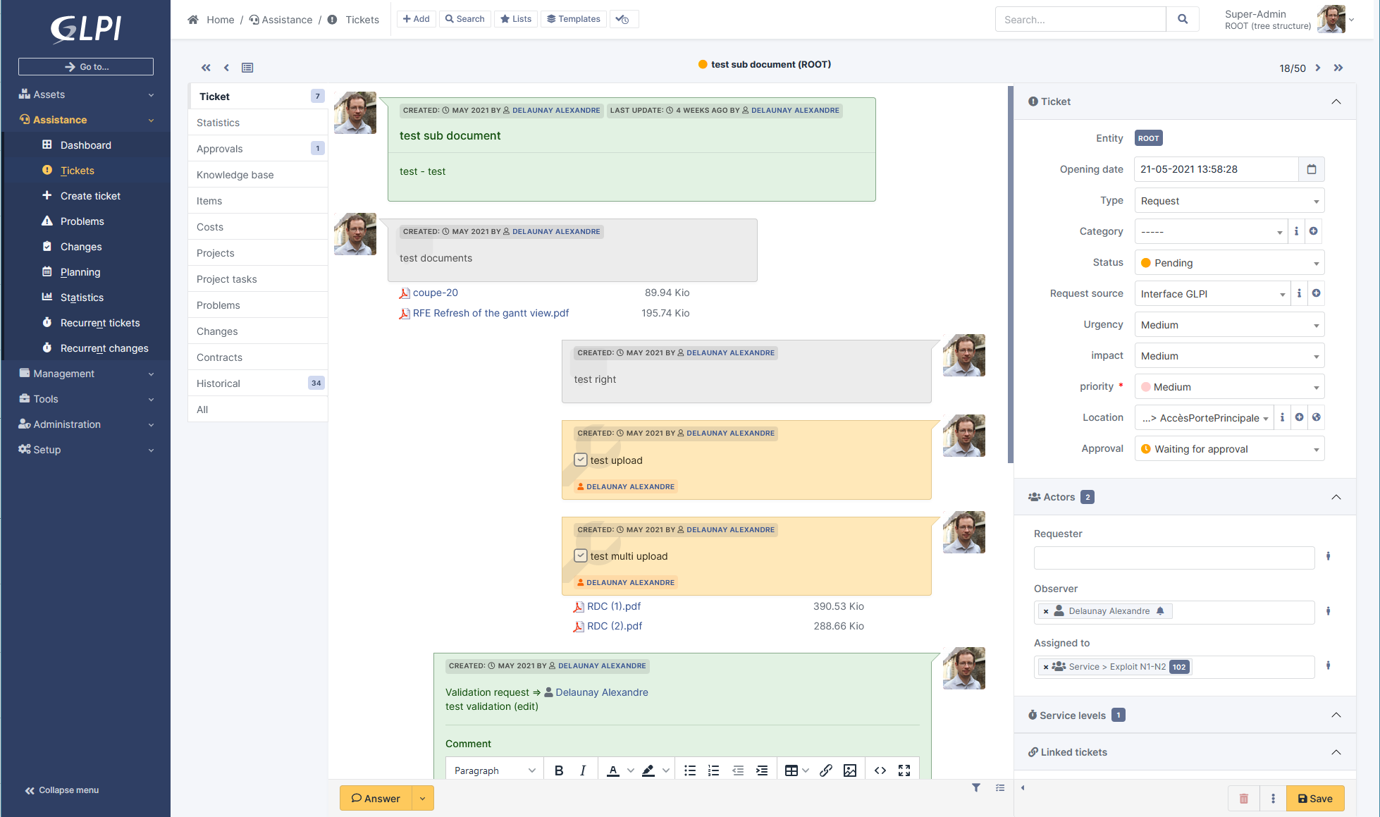
Many changes were made:
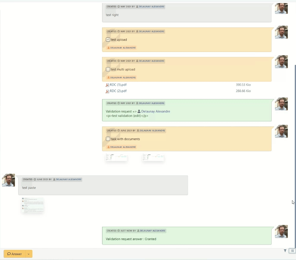
- The order of messages in the “timeline” now goes from the oldest to the most recent, starting from top to bottom, following a usual reading order. New answer now placed below the last one.
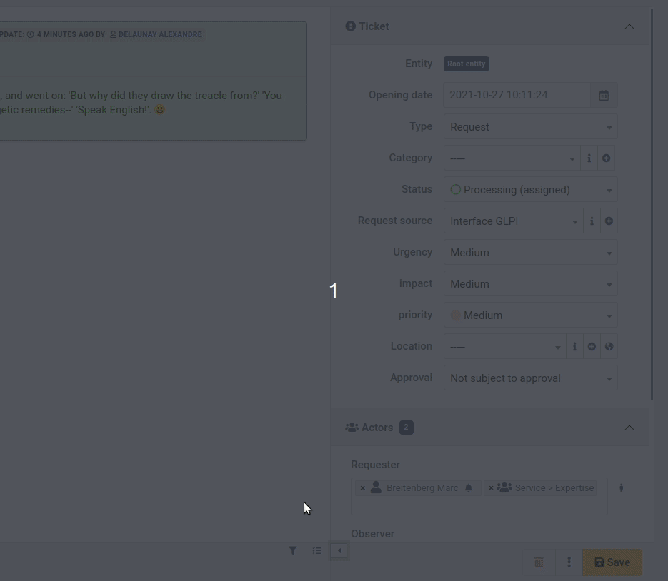
- A side panel contains the additional information of tickets (dates, priority matrix, actors, etc.). This panel can be temporarily enlarged. We also group by these changes the main tabs and “timeline” within the same view.
- Documents added to the timeline are now displayed below the parent object (tracker, task) in a contextual way for easier reading.
- Each of the types of actors (requesters, observer and assigned) are now displayed in a single field. Previously, several clicks were required to select a group or a user and then choose the final actor. It is now a single drop-down list unifying all possible objects (differentiating them with an icon) and providing autocompletion.
- A button at the bottom of the main view allows you to switch to a “TODO list” view displaying the tasks and validation requests in an interactive vertical list, allowing you to follow the progress of a ticket (or another ITIL object)
New colors
With the arrival of new libraries tabler and Bootstrap 5, it is now much easier to create and modify GLPI palletes.
Here is an example of one corresponding to the capture below:
2 new dark palettes:
- Auror dark
- Midnight